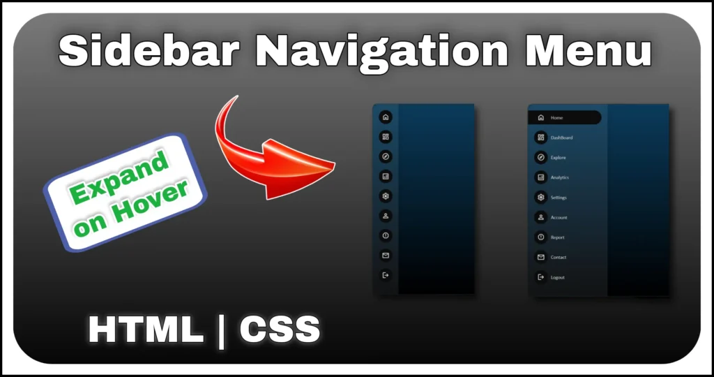
An expandable sidebar menu with tooltip is one of the most useful navigation components for modern websites and dashboards. This design lets users navigate using simple icon-only links in a collapsed state, while showing helpful tooltips on hover.
When expanded, it reveals full text labels, promotional banners and social media links — making it both minimal and feature-rich.
Structure Overview
This sidebar menu is carefully organized into four main parts:
<aside>
    <div class="sidebar">
        <div class="sidebar-header"> <a href="#" class="logo"> <img src="/public/assets/dummy_logo.png" alt="Logo"> <span class="text">CodeWebStack</span> </a> </div>
        <div class="separator"></div>
        <ul>
            <li> <a href="#" class="item-content"> <span class="bx bx-home"></span><span class="tooltip">Home</span> </a> </li>
            <li> <a href="#" class="item-content"> <span class="bx bx-category-alt"></span><span class="tooltip">Categories</span> </a> </li>
            <li> <a href="#" class="item-content"> <span class="bx bx-bolt-circle"></span><span class="tooltip">Analytics</span> </a> </li>
            <li> <a href="#" class="item-content"> <span class="bx bx-compass"></span><span class="tooltip">Explore</span> </a> </li>
            <li> <a href="#" class="item-content"> <span class="bx bx-news"></span><span class="tooltip">Latest</span> </a> </li>
            <li> <a href="#" class="item-content"> <span class="bx bx-notepad"></span><span class="tooltip">Updates</span> </a> </li>
        </ul>
        <div class="sidebar-footer">
            <div class="upgrade-wrapper">
                <h3>Get 50% off | Limited Time</h3> <span class="msg">Your Free Trail Expiring Soon, Upgrade to a premium plan to avail a discount of 50%</span> <button class="upgrade-btn">Upgrade Plan</button>
            </div>
            <div class="connect-with-us"> <a href="#" class="bx bxl-youtube"></a> <a href="#" class="bx bxl-instagram"></a> <a href="#" class="bx bxl-discord"></a> <a href="#" class="bx bxl-codepen"></a> <a href="#" class="bx bxl-facebook"></a> </div>
            <div class="separator"></div>
            <div class="expand-btn"><span class="ex-col-icon"></span><span class="text">Collapse</span></div>
        </div>
    </div>
</aside>- Sidebar Header
- Includes the website logo and branding name. When collapsed, only the logo is visible.
- When expanded, both the logo and text label are shown side by side.
- Navigation Menu
- A vertical list of items for categories.
- In collapsed mode, only icons are displayed. Tooltips appear on hover to describe each icon clearly.
- In expanded mode, both icons and text labels are visible for better navigation.
- Sidebar Footer Section
- Displays a special upgrade banner with discount details and a call-to-action button.
- Includes social media links (YouTube, Instagram, Discord, CodePen, Facebook) for quick community access.
- A collapse/expand toggle button with an icon switch makes it easy to shrink or open the sidebar.
- Interactive Elements
- Tooltips with smooth hover effects in collapsed mode.
- Expand button toggles between two states: compact and full-width sidebar.
- Upgrade button styled with hover effects for emphasis.
Styling & Design
The expandable sidebar menu with tooltip follows a clean, professional design:
@import url(https://fonts.googleapis.com/css2?family=Baloo+Bhai+2:wght@400&display=swap);

@import url(https://cdnjs.cloudflare.com/ajax/libs/boxicons/2.1.0/css/boxicons.min.css);

:root {
    --sidebar-width: 300px;
}

body {
    min-height: 100vh;
    font-family: 'Baloo Bhai 2';
    background-color: #f0f1ff;
}

a {
    text-decoration: none;
    color: black;
}

li {
    list-style: none;
}

.sidebar {
    width: 60px;
    display: grid;
    padding: 10px;
    min-height: 100vh;
    background-color: white;
    transition: width .2s ease;
    grid-template-rows: auto auto 1fr auto;
}

.sidebar-active .sidebar {
    width: var(--sidebar-width);
}

.logo {
    display: flex;
    align-items: center;
    font-size: 20px;
    font-weight: 600;
}

.sidebar-active .logo {
    gap: 10px;
}

.sidebar-header img {
    width: 40px;
    height: 40px;
}

.text {
    width: 0;
    white-space: nowrap;
    overflow: hidden;
}

.sidebar-active .text {
    width: auto;
}

.separator {
    margin: 10px 0;
    width: 100%;
    height: .1px;
    background-color: rgb(0 0 0 / 12%);
}

.item-content {
    display: flex;
    gap: 20px;
    padding: 10px;
    align-items: center;
    border-radius: 8px;
    position: relative;
}

.item-content:hover,
.expand-btn:hover {
    background-color: #f2f3fe;
}

.item-content .bx {
    font-size: 20px;
    line-height: 1.35;
}

body:not(.sidebar-active) .tooltip {
    position: absolute;
    right: -20px;
    top: 50%;
    color: white;
    padding: 5px 15px;
    font-size: 15px;
    line-height: 1.5;
    border-radius: 5px;
    opacity: 0;
    visibility: hidden;
    transition: opacity .3s;
    background-color: rgb(22, 22, 22);
    transform: translate(100%, -50%);
}

body:not(.sidebar-active) .tooltip::before {
    content: "\ee04";
    font-family: 'boxicons';
    position: absolute;
    left: 0;
    top: 50%;
    font-size: 20px;
    color: rgb(22, 22, 22);
    transform: translate(-50%, -50%);
}

body:not(.sidebar-active) .item-content:hover .tooltip {
    visibility: visible;
    opacity: 1;
}

.upgrade-wrapper {
    display: none;
    gap: 10px;
    margin: 20px 0;
    padding: 15px 10px;
    text-align: center;
    border-radius: 10px;
    border: 1px solid #b8ccff;
    width: calc(var(--sidebar-width) - 20px);
    background: linear-gradient(130deg, #76d7f66b, #3aff8275);
}

.sidebar-active .upgrade-wrapper {
    display: grid;
}

.msg {
    font-size: 12px;
    line-height: 1.2;
    color: #464646;
}

.upgrade-btn {
    padding: 5px;
    border: none;
    line-height: 1.8;
    font-weight: 600;
    color: #000000;
    margin-top: 15px;
    cursor: pointer;
    font-size: 15px;
    border-radius: 10px;
    letter-spacing: .5px;
    font-family: "Baloo Bhai 2";
    background-color: #ffffff;
    box-shadow: 0px 0px 10px 0px #00000018;
}

.upgrade-btn:hover {
    background-color: #111111;
    color: rgb(246, 246, 246);
}

.connect-with-us {
    display: none;
    justify-content: space-around;
}

.sidebar-active .connect-with-us {
    display: flex;
}

.connect-with-us a {
    padding: 5px;
    font-size: 20px;
}

.expand-btn {
    display: flex;
    gap: 10px;
    padding: 5px;
    cursor: pointer;
    line-height: 1.35;
    border-radius: 8px;
    align-items: center;
}

.ex-col-icon::before {
    content: "\e9b6";
    font-family: "boxicons";
    font-size: 20px;
}

.sidebar-active .ex-col-icon::before {
    content: "\e9b7";
}- Collapsed Sidebar (60px width)
- Only icons are visible.
- Tooltips appear as floating black boxes with arrows when hovering over icons.
- Expanded Sidebar (300px width)
- Full navigation text labels appear next to icons.
- Extra content like upgrade banner and social links become visible.
- Typography & Icons
- Uses the Baloo Bhai 2 font for readability and personality.
- Leverages Boxicons for lightweight, scalable icons.
- Hover Effects
- Navigation items highlight with a light background when hovered.
- Upgrade button changes from white to black with contrasting text.
- Smooth transitions ensure a polished interactive experience.
JavaScript Section
To make the expandable sidebar menu with tooltip interactive, a lightweight JavaScript function is used. The script mainly handles the toggle behavior of the sidebar, allowing it to switch between the collapsed and expanded states with a smooth animation.
document.querySelector('.expand-btn').addEventListener('click', () =>
document.body.classList.toggle('sidebar-active'))
The JavaScript part of the expandable sidebar menu with tooltip is minimal yet powerful. By only handling the toggle logic and letting CSS manage animations, the menu remains fast, responsive and user-friendly. This approach keeps the code clean while delivering a professional navigation experience.
Features
This expandable sidebar menu comes packed with modern features:
- Compact mode with tooltips → keeps the sidebar slim while still user-friendly.
- Expandable layout → toggles between icon-only and full-text navigation.
- Promotional upgrade section → draws user attention with gradient styling.
- Integrated social icons → connect users with your community instantly.
- Responsive design → can easily adapt for desktop dashboards or mobile views.
- Lightweight JavaScript → only a single toggle event is needed.
Use Cases
This sidebar design is ideal for:
- Admin dashboards → where users need quick access to multiple sections.
- SaaS platforms → with subscription upgrade prompts.
- Portfolio websites → with navigation icons and branding.
- Community portals → combining social media links with navigation.
Final Thoughts
The expandable sidebar menu with tooltip strikes the right balance between minimal design and functional navigation. Its collapsed state saves screen space while tooltips ensure usability and the expanded view provides full details with extra promotional elements. With HTML, CSS and a touch of JavaScript, you can easily integrate this sidebar into any modern website or application.